


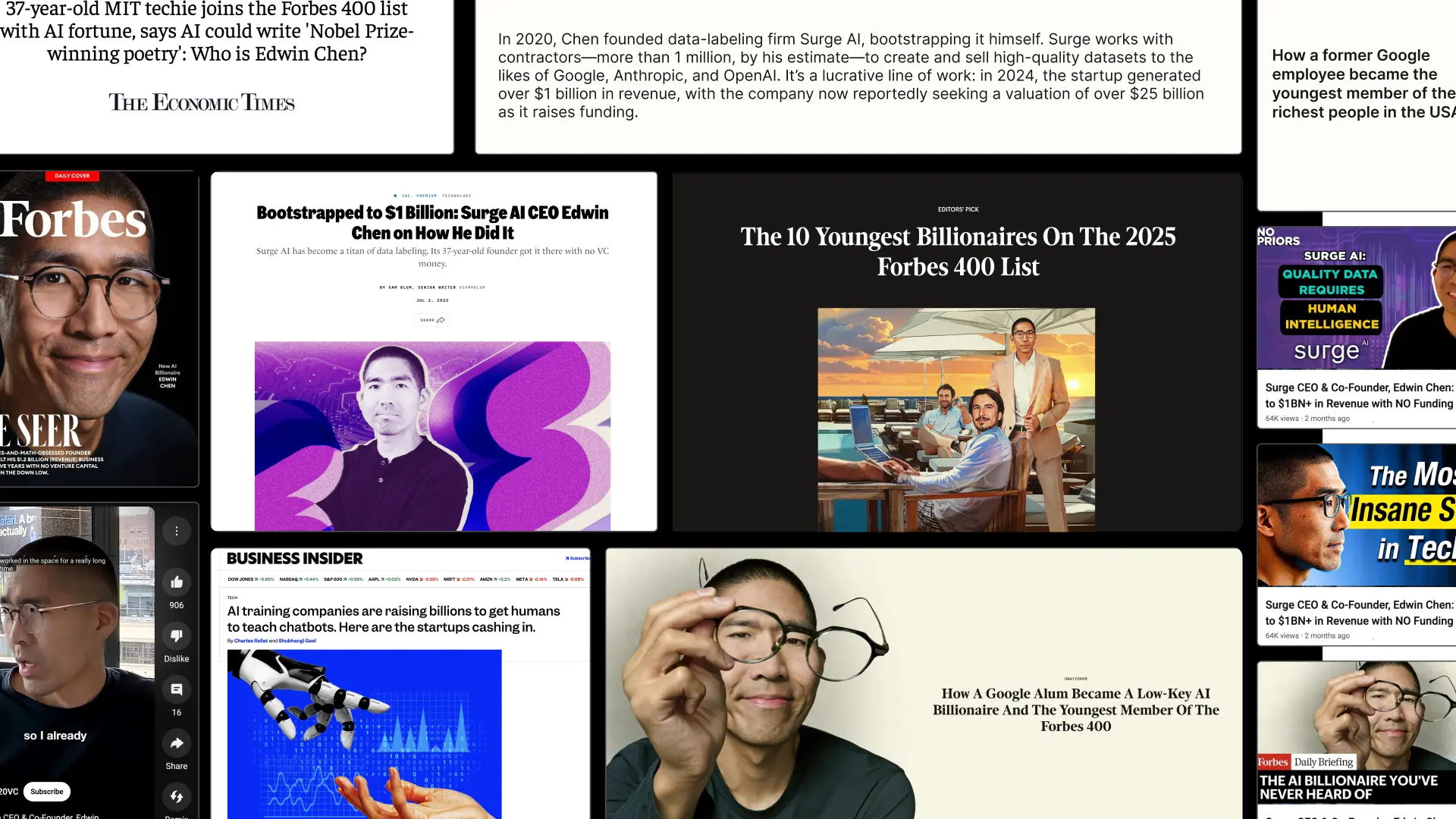
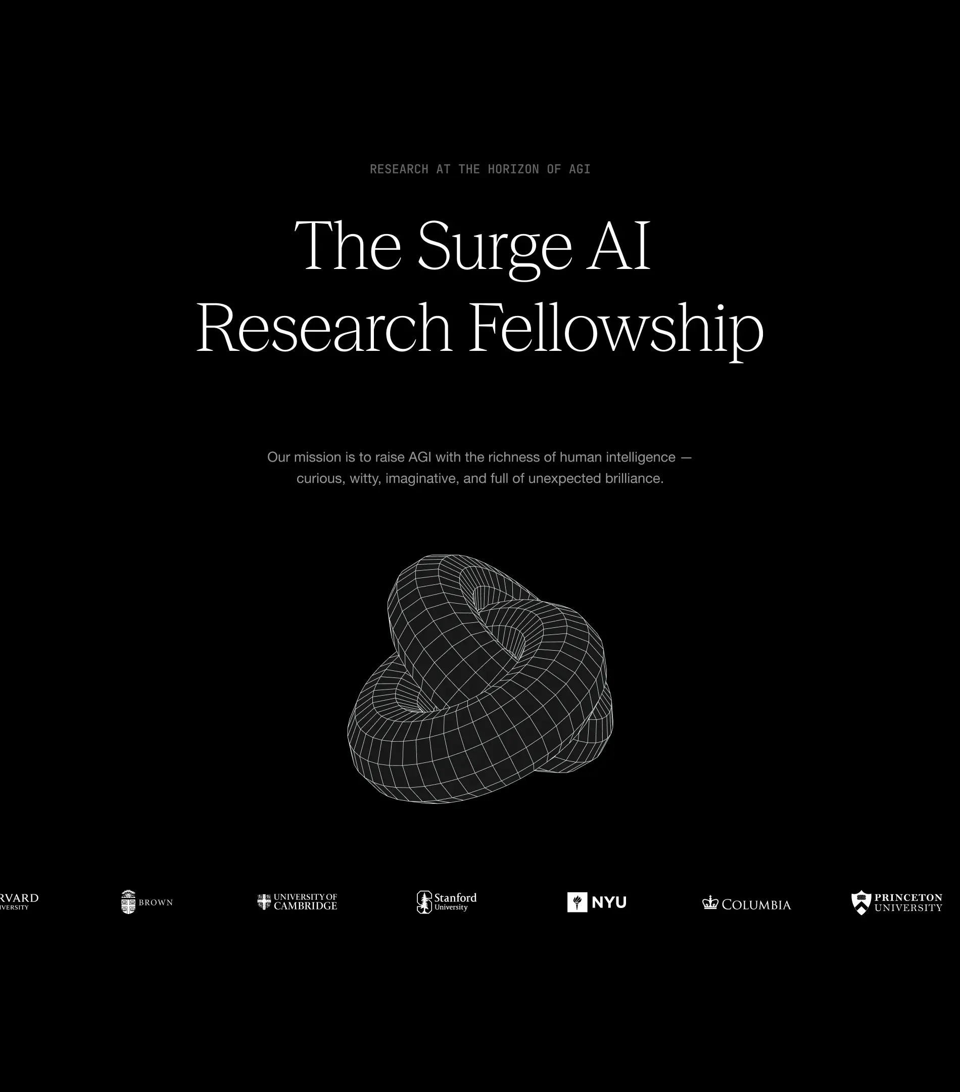
From day one, Surge needed more than a brand that looked good. They needed design that built credibility, earned trust, and scaled with them as they grew. They needed a design partner that ensures they stand out in the crowded world of AI infrastructure.
They chose Konpo. More than a vendor, we became their plug-and-play design team: senior talent embedded alongside leadership, shaping everything from their first identity to their website, product, and systems. At every stage, Surge found in Konpo a partner they could depend on.
.webp)

.webp)


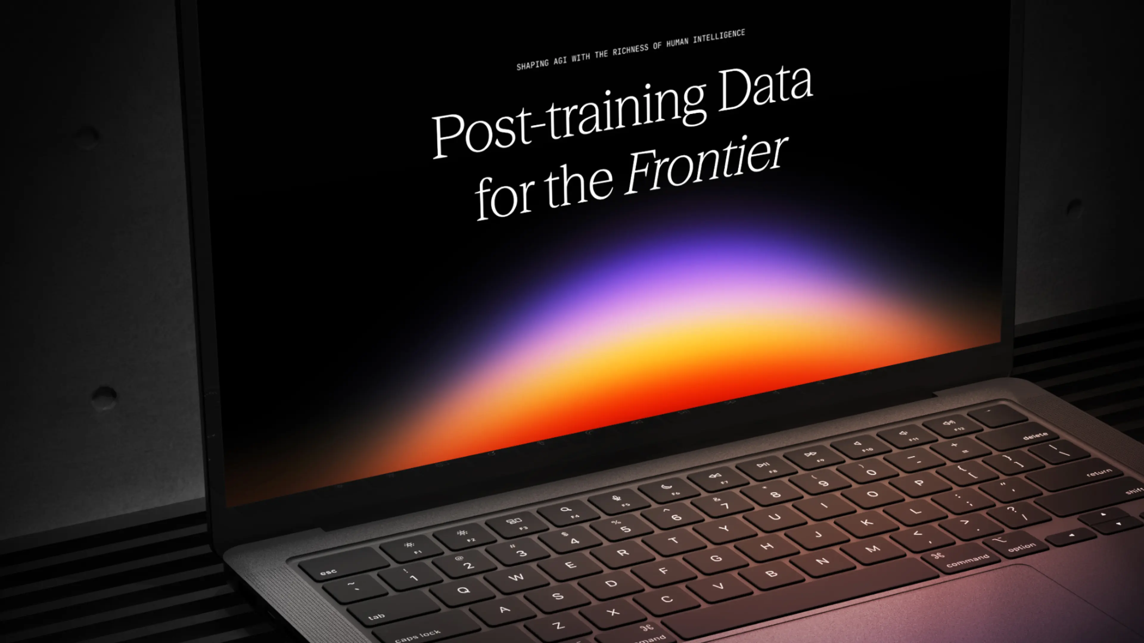
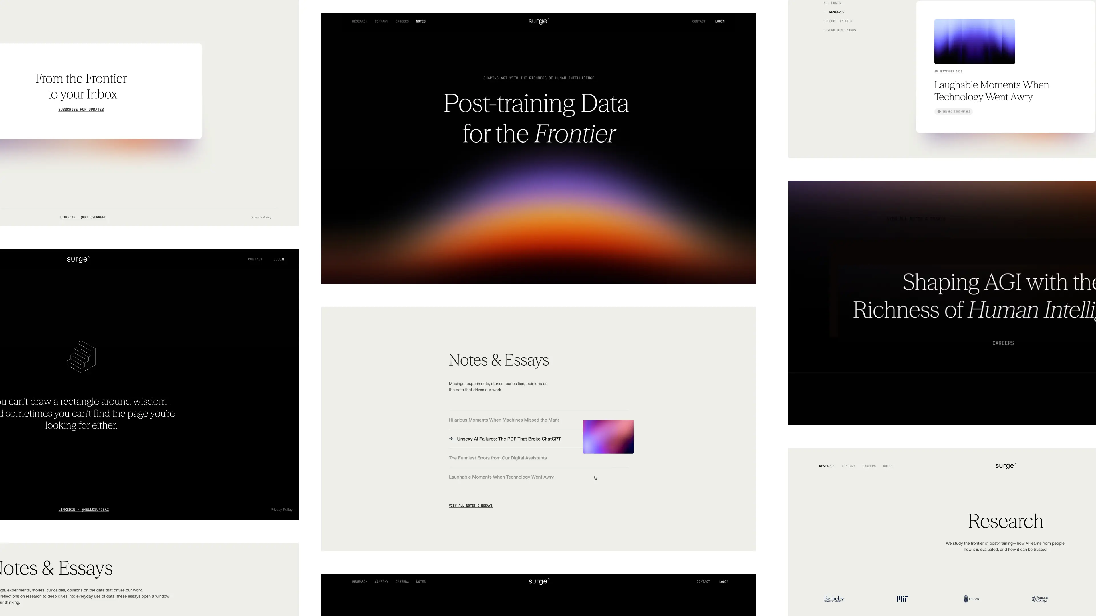
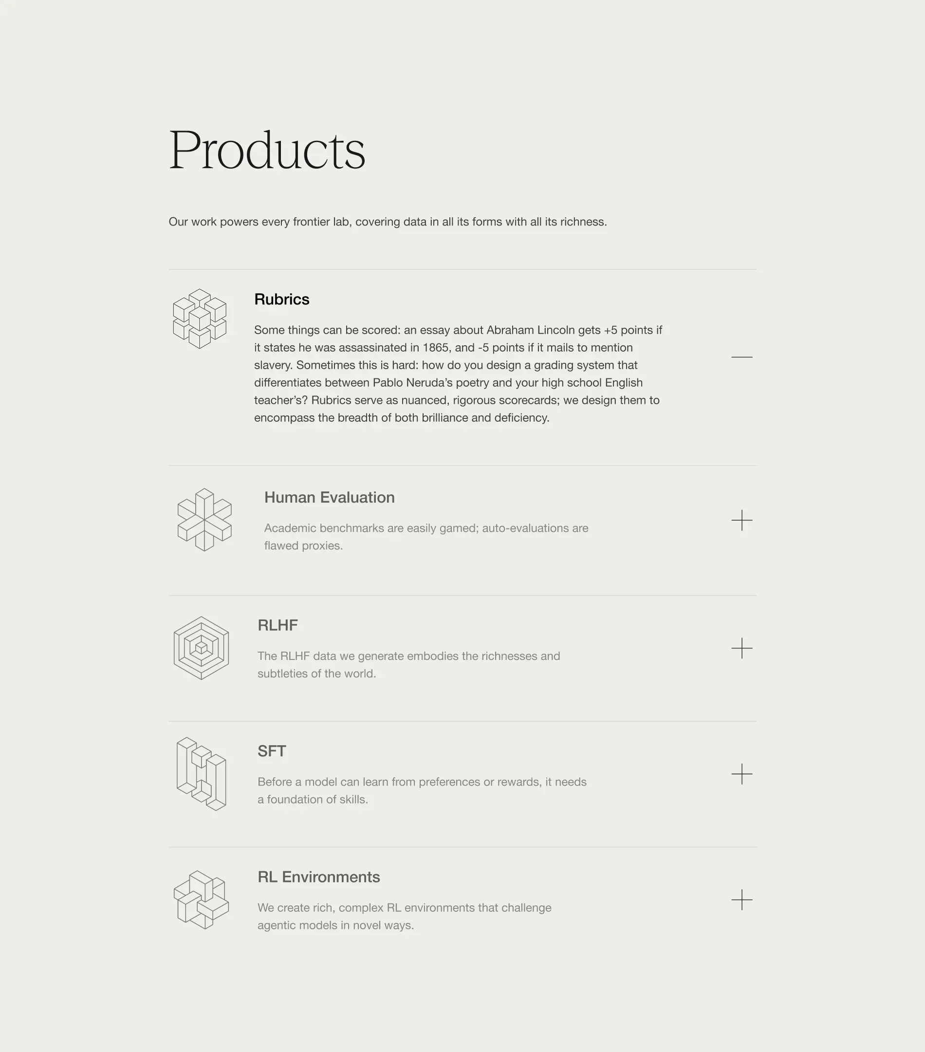
Our collaboration has become a long-term partnership that helped Surge grow from early explorations to a brand adopted by the leading AI and technology companies and a product internationally recognized and awarded.
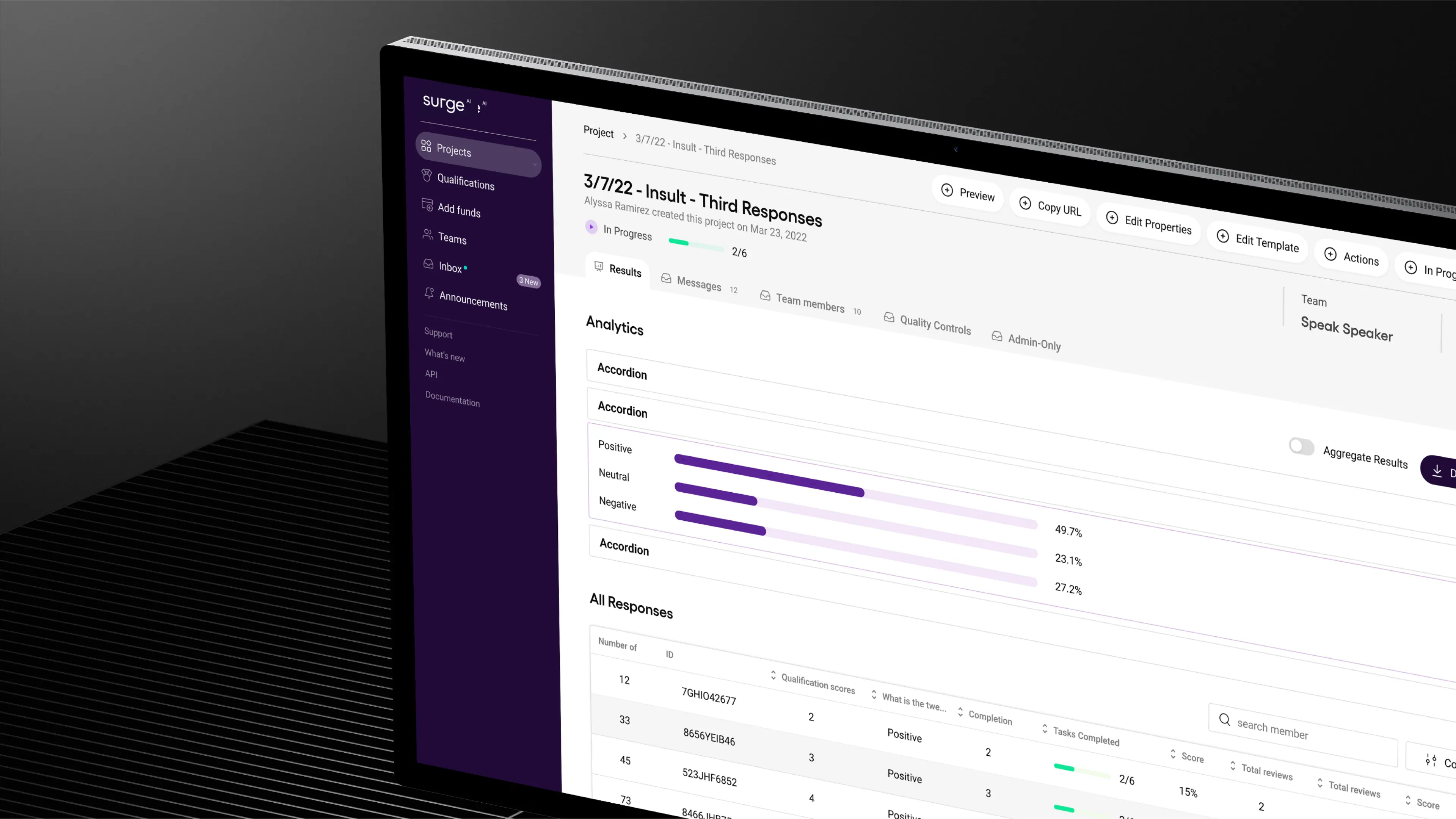
We built a bold, distinctive identity in an industry defined by sameness, designed a product experience that balanced delight with enterprise-grade usability, and crafted a design system to keep them consistent as they scaled.
As Surge now looks to fetch a valuation of over $15 billion in its first capital raise, we’re leading phase two of their branding. The goal: to build a brand that not only wins attention and trust, but one that matches the ambition and credibility of a company operating at that scale.
- Founder - Edwin Chen
- Year - 2025
- Industry - Artificial Intelligence
- Scope - Brand · Site · Systems
- Website - www.surgehq.ai

ComPsych needed a rebrand built to win. Younger competitors with sharper, design-driven branding were pulling attention away from the world’s largest provider of employee assistance programs (EAPs), a company supporting over 130 million people across 190 countries. They turned to Konpo to make sure their brand matched their scale and credibility. The mission: win back market share, turn reputation into loyalty, and defend their position at the top.
.webp)
.webp)
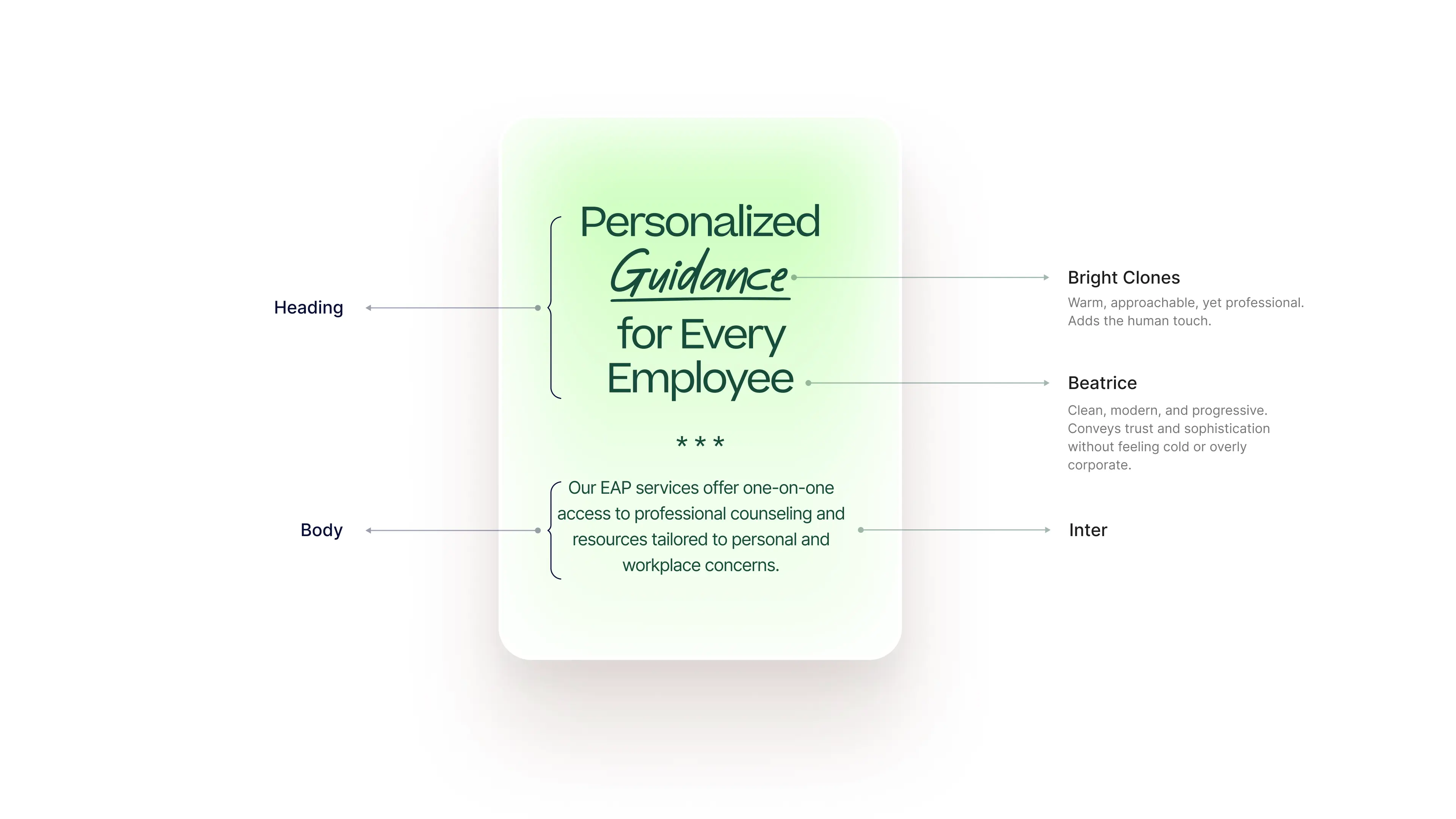
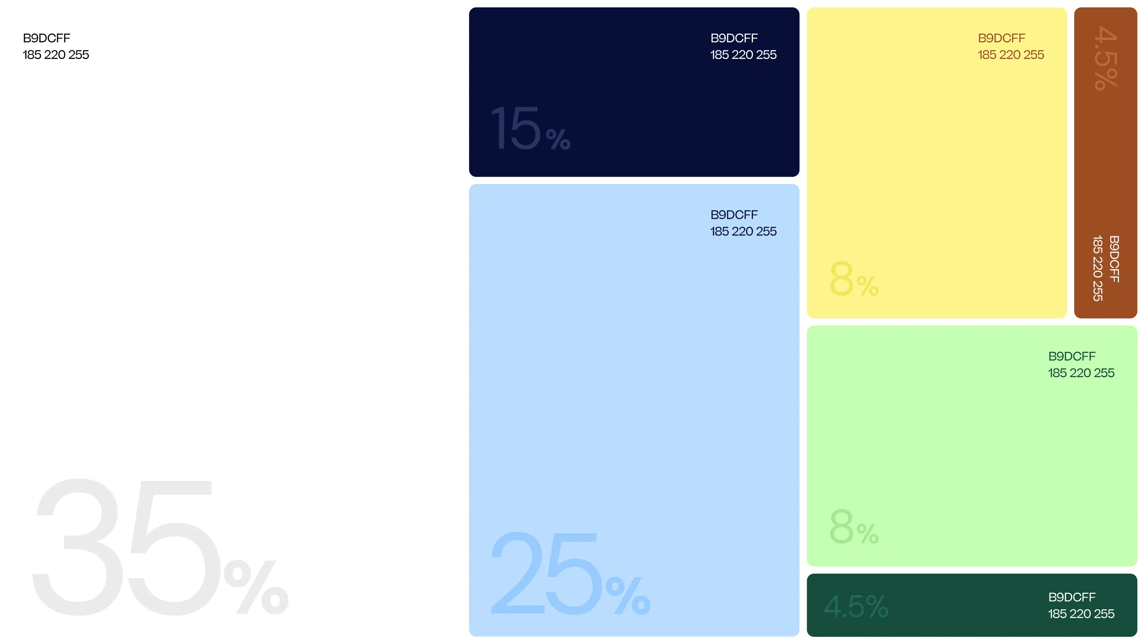
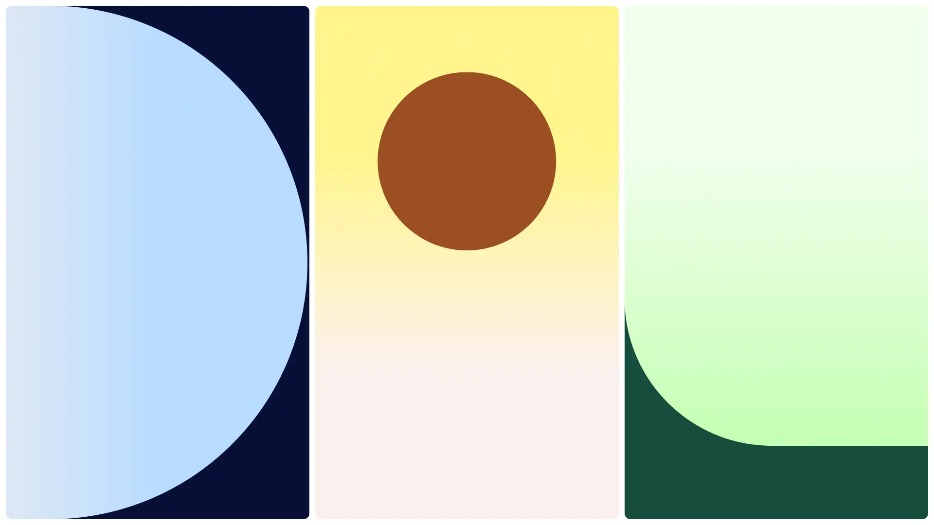
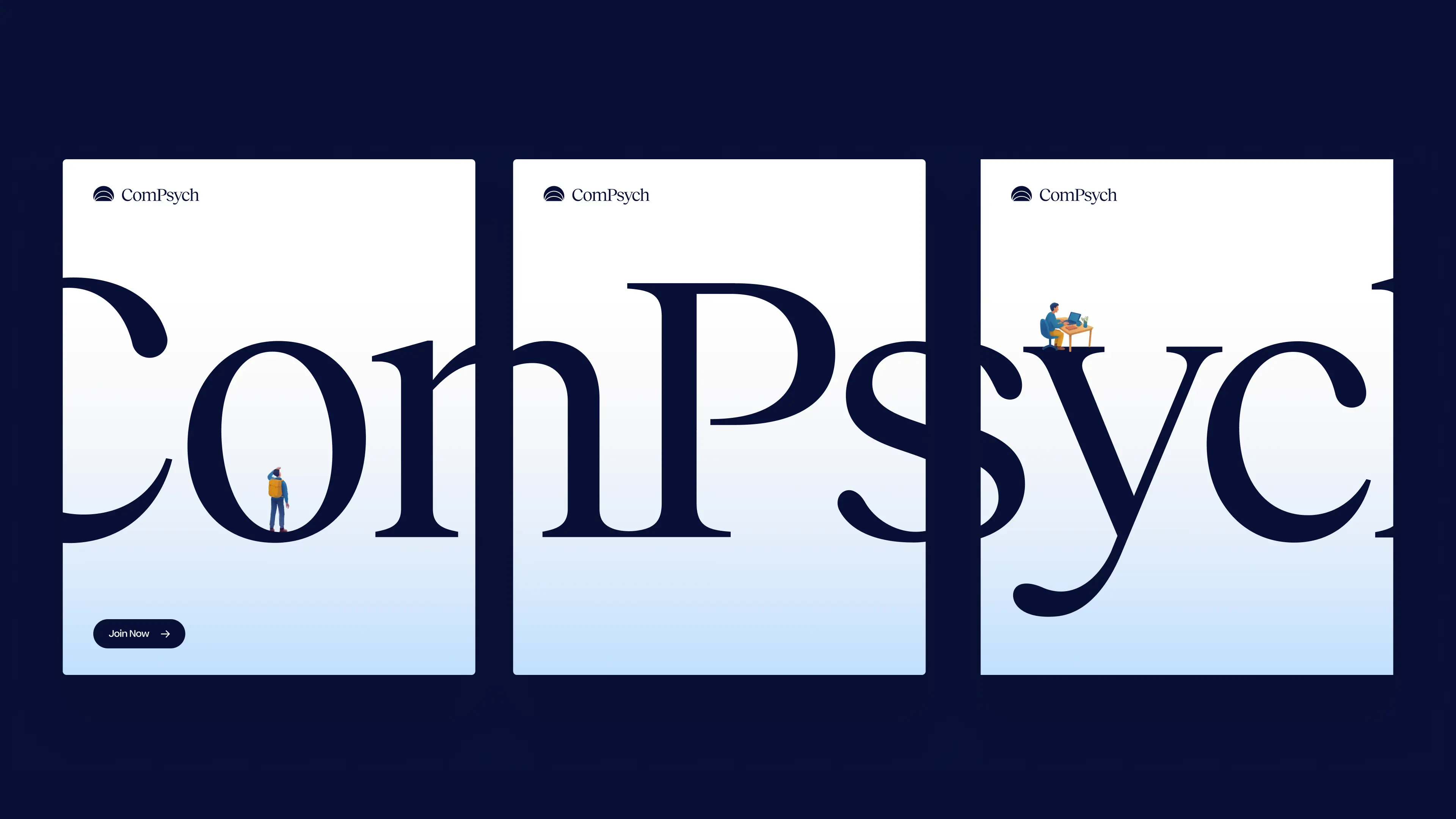
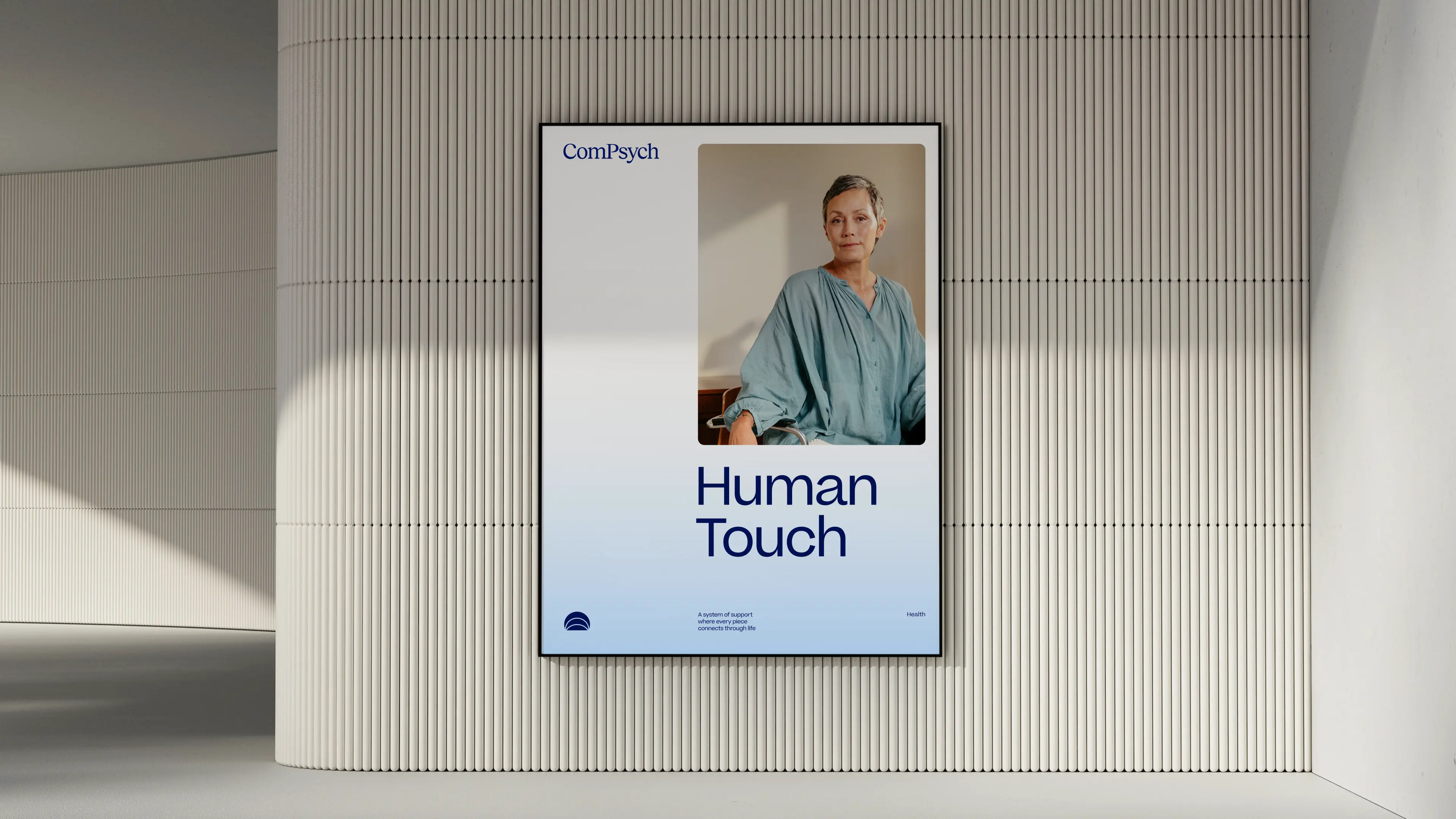
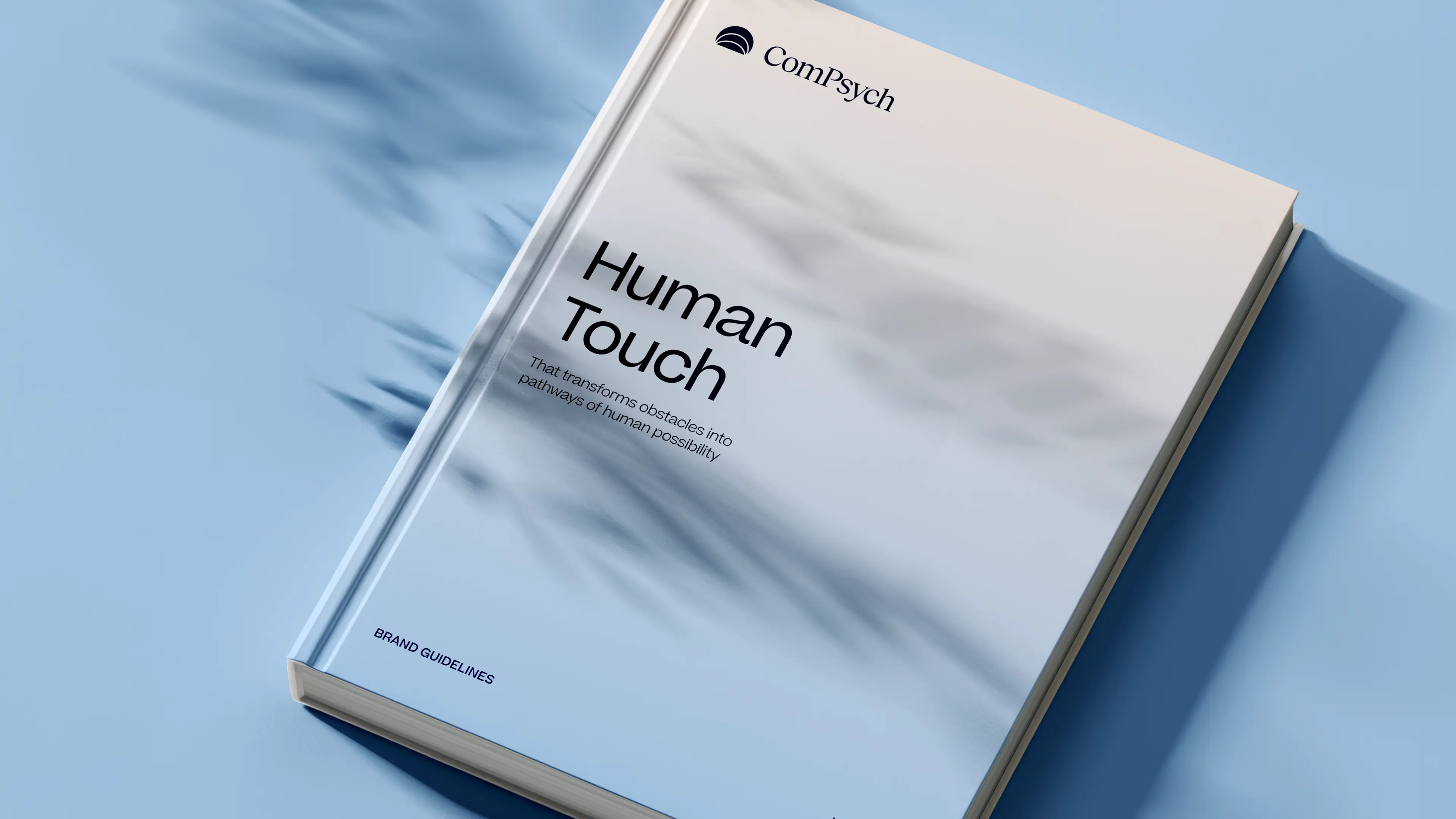
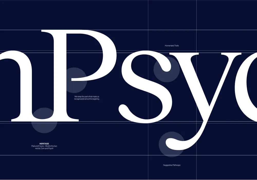
Every element of the ComPsych rebrand was built to show the strength of a category leader, but for today’s market and tomorrow’s. The new logo centers on a glowing core, with expanding ripples signalling growth, support, and scale. Their signature blue was sharpened with a modern palette designed to stand out with confidence, not noise. But what’s a rebrand without discipline to execute it? We built a dedicated brand hub that gave ComPsych everything, from logos to illustrations to voice, to apply their new identity consistently across 75,000+ organizations worldwide. And we delivered it beyond our original scope. The result: a brand that doesn’t just keep up with the competition, but takes back the lead. With a stronger identity and a system to sustain it, ComPsych now has the edge to defend its dominance and keep winning in a design-driven market.
- Industry - Employee Assistance Program (EAP)
- Scope - Brand
- Brand Hub - compsych.konpo.co
- Website - compsych.com
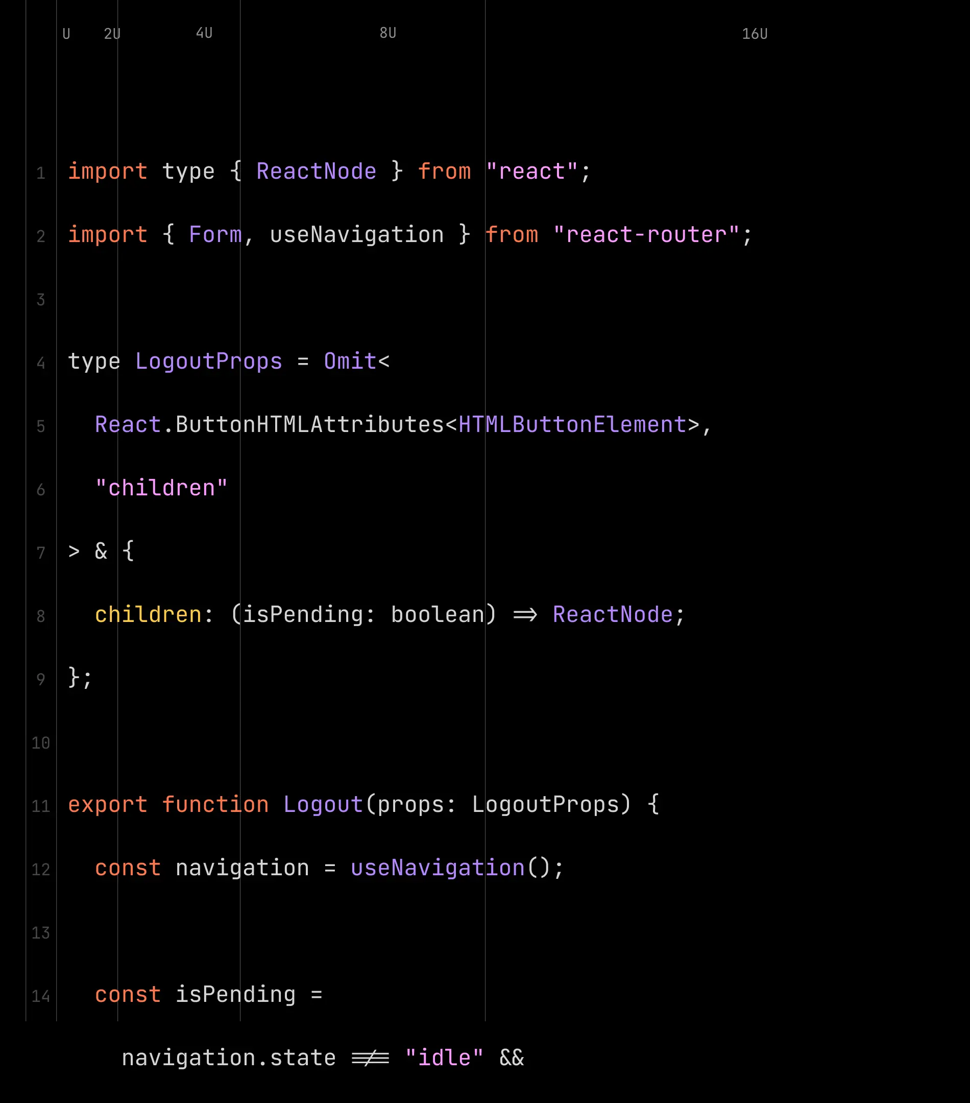
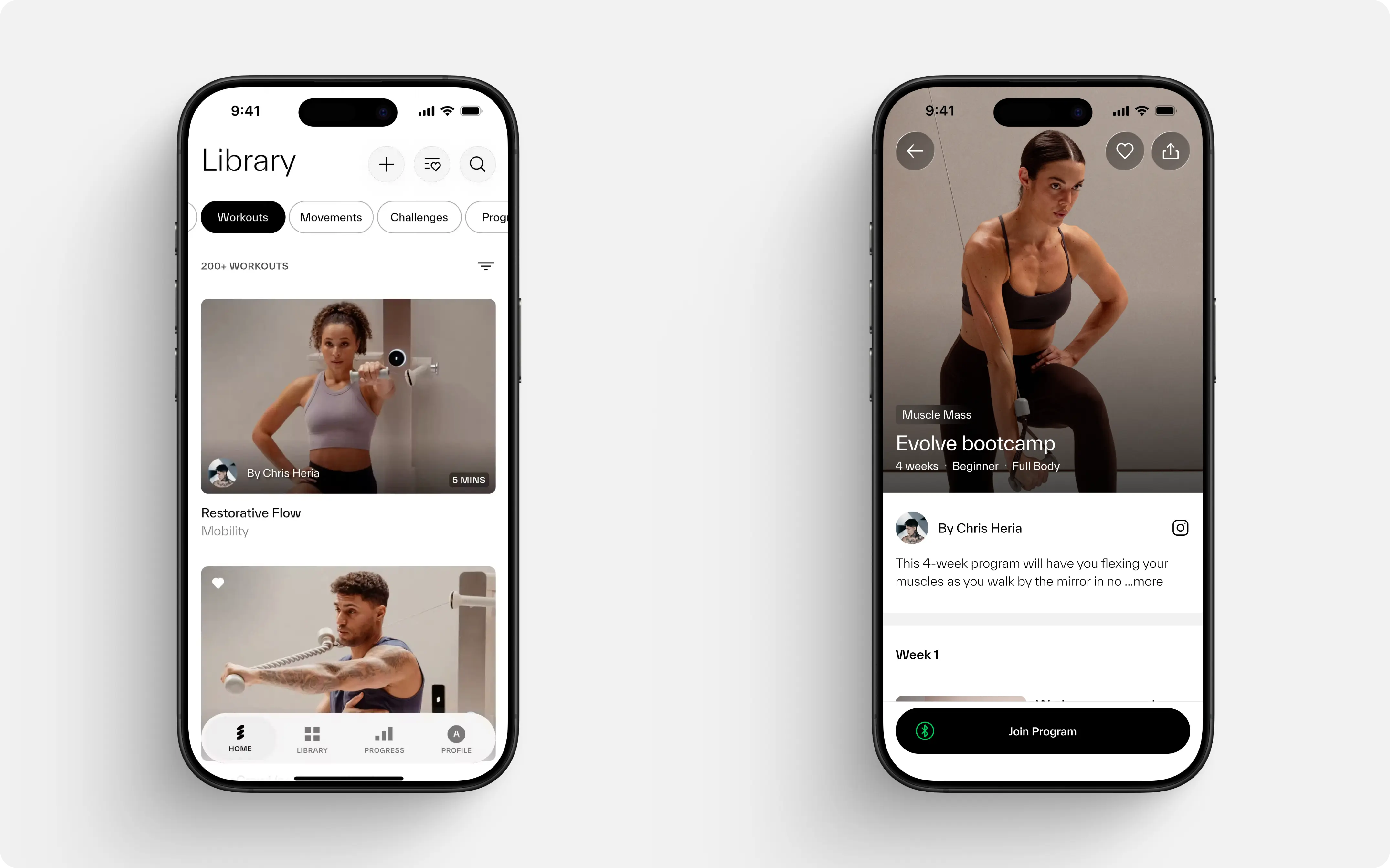
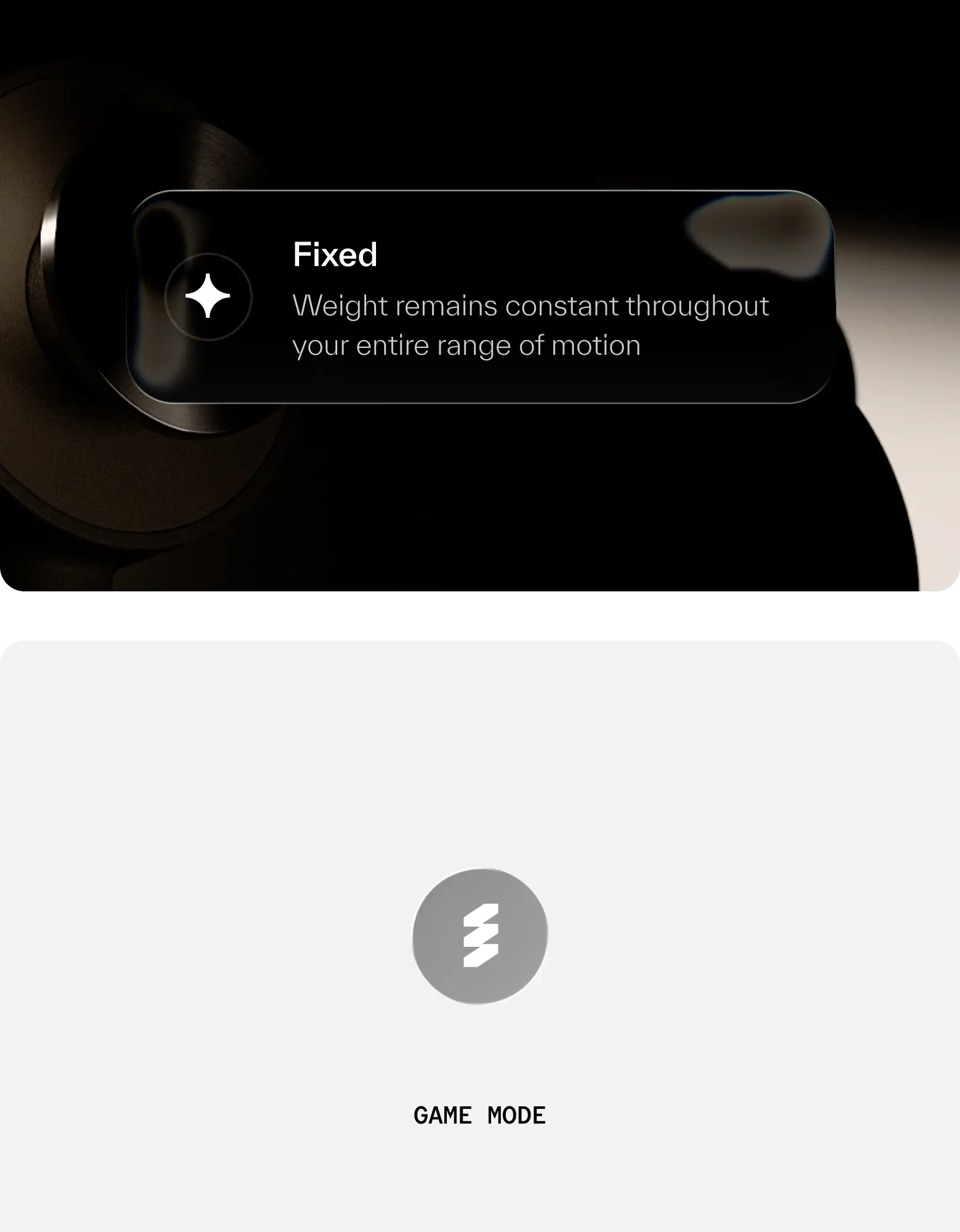
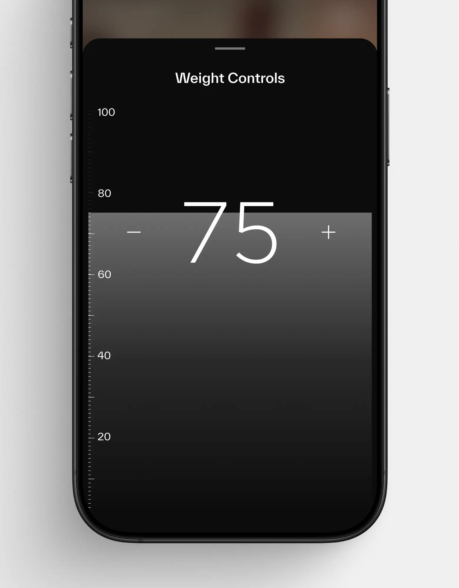
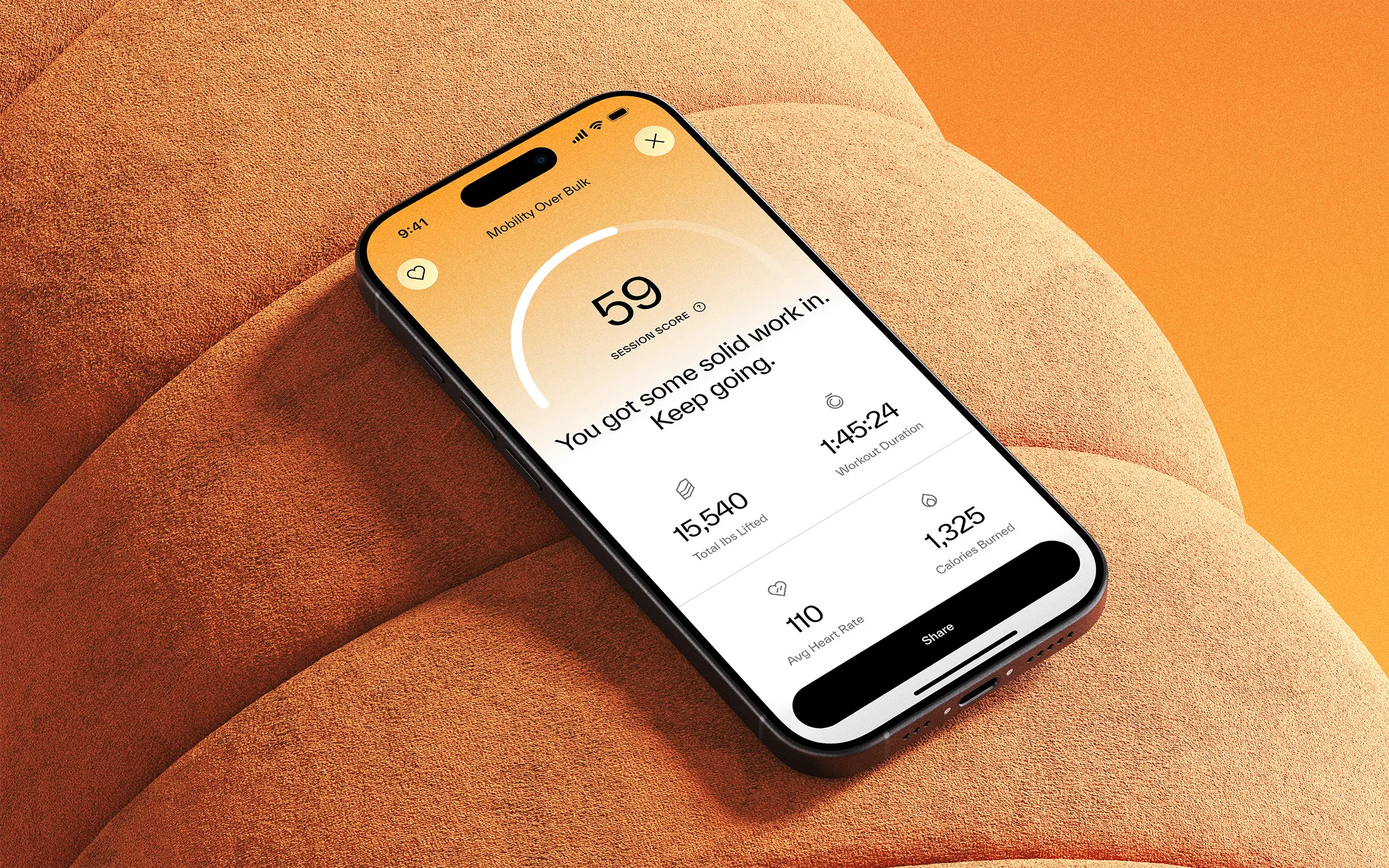
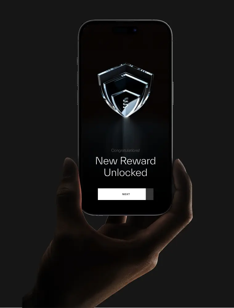
amp Fitness set out to launch its AI-powered strength training system with leadership and talent from Apple, DraftKings, Meta, Nike, and Spotify — people who held the highest design standards. To stand out in a crowded fitness space, they needed a design partner who could move as fast as they did and deliver world-class quality. That’s where Konpo came in. As their plug-and-play design studio, we worked elbow-to-elbow with Amp’s leadership to marry hardware and software into a seamless consumer experience. From product design to scalable design systems, we turned their ambitious vision into award-winning, user-loved reality. When the standards are highest, the right design partner makes all the difference.
.webp)
%201.webp)
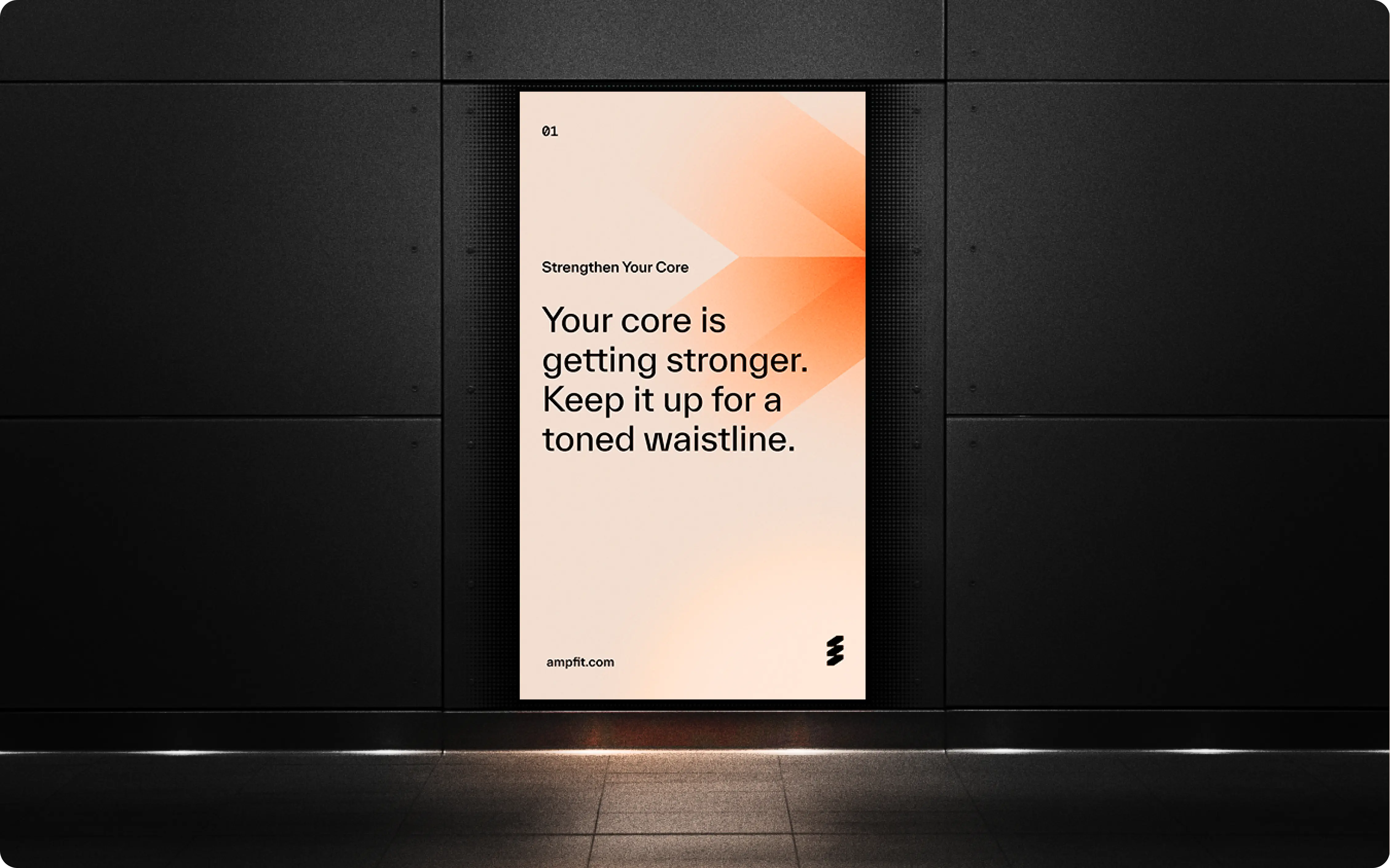
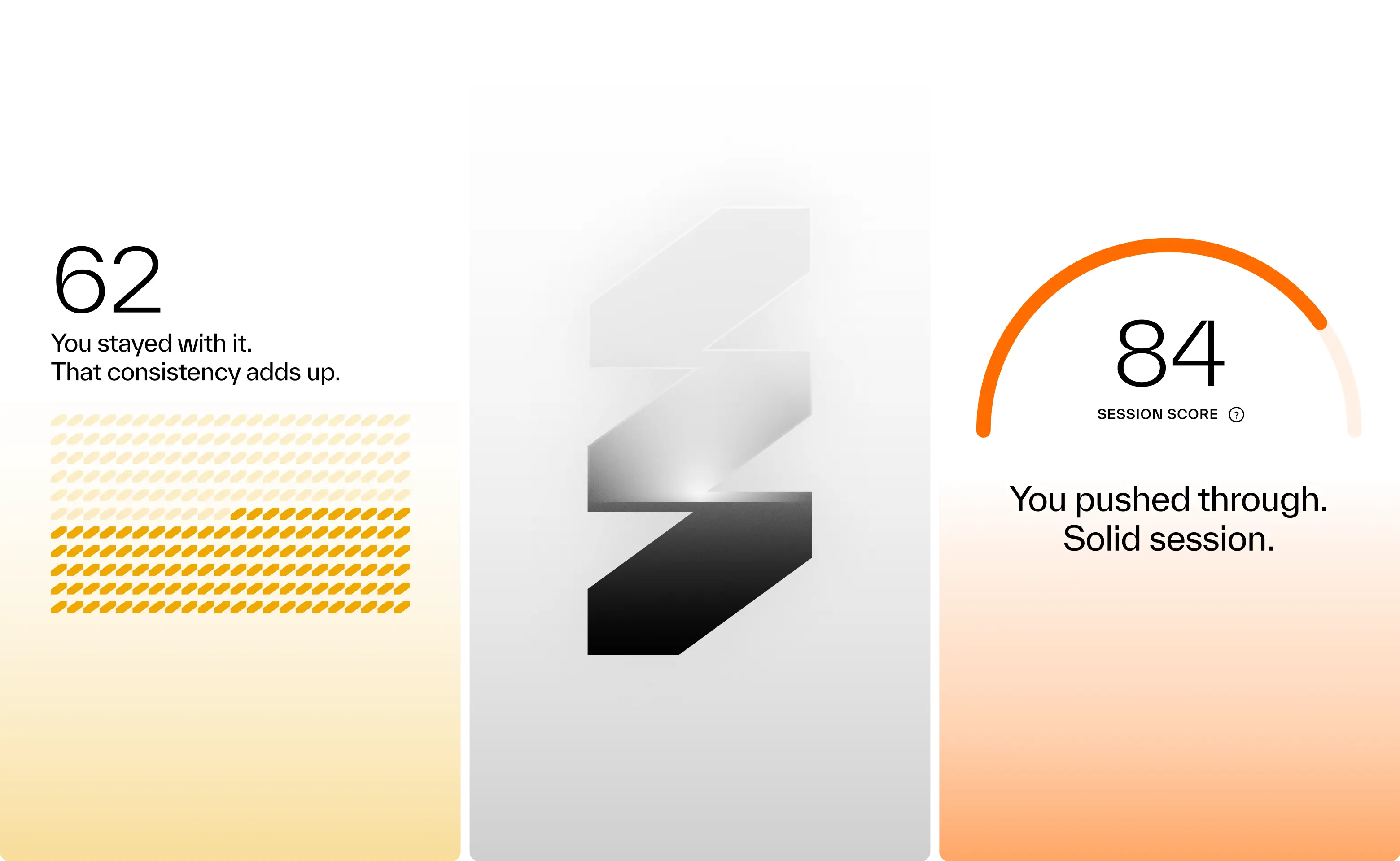

Results so far: 40,000 users, multiple awards, and a sleek wall-mounted system paired with a companion app. Working with amp meant translating adaptive resistance hardware, smart coaching, and modular accessories into a cohesive consumer experience. Add to that a team backed by Sports Science PhDs and leaders from Apple, Meta, and Nike, and the expectations were clear: nothing short of excellence would do. Rising to that challenge not only delivered results for amp, but pushed Konpo to sharpen our own systems and raise the bar. Challenge accepted. Mission accomplished.
- Founder - Shalom Meckenzie
- Year - 2024
- Industry - Fitness · Artificial Intelligence
- Scope - Brand · Product · Systems
- Website - www.ampfit.com
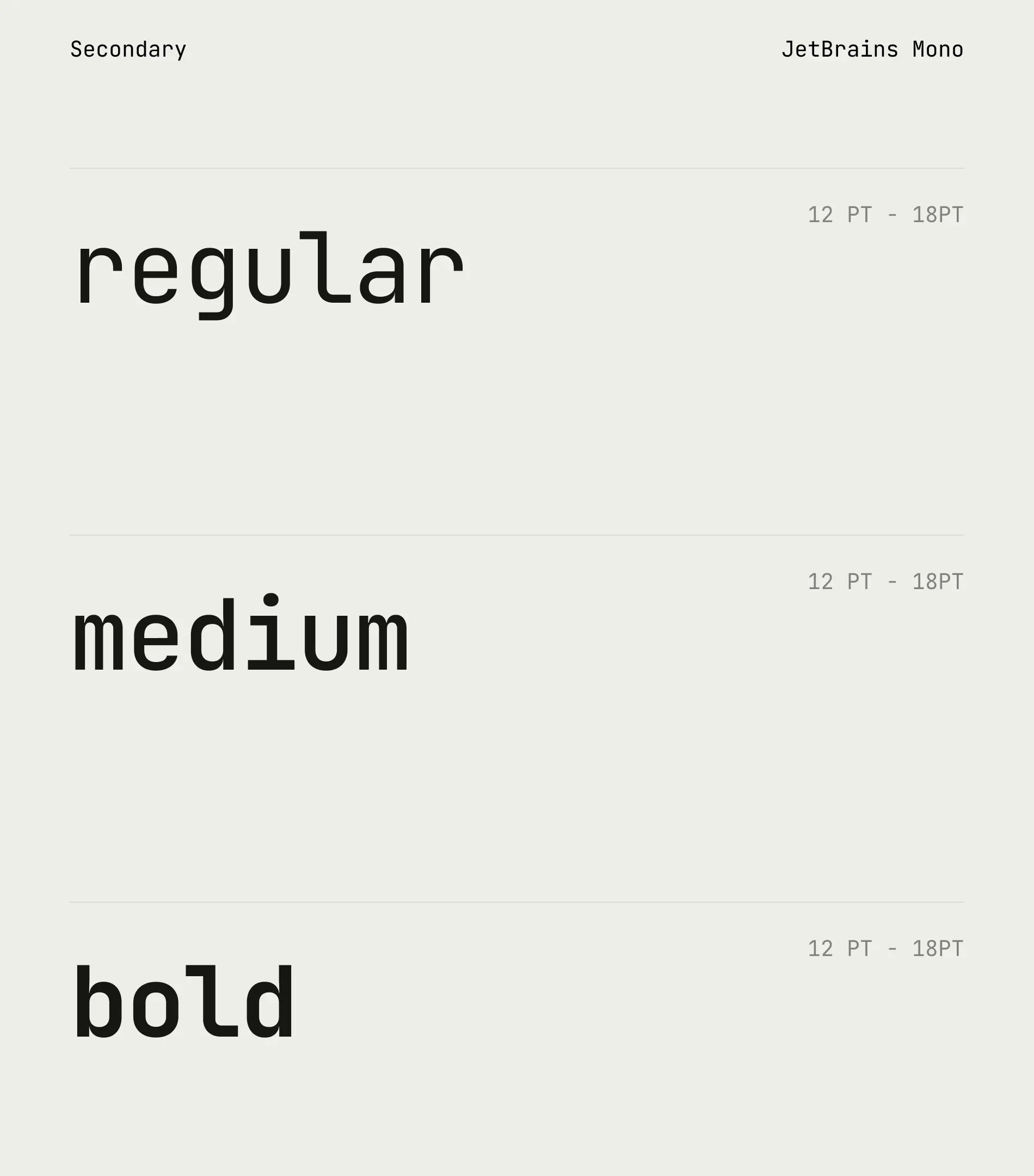
Design Systems
Scalable design systems for product and marketing teams. Made with style.


.webp)
.webp)
.webp)
.webp)

.webp)
We design the source-of-truth across all touch points.
For enterprise and consumer software. For product and marketing teams.
Consistency
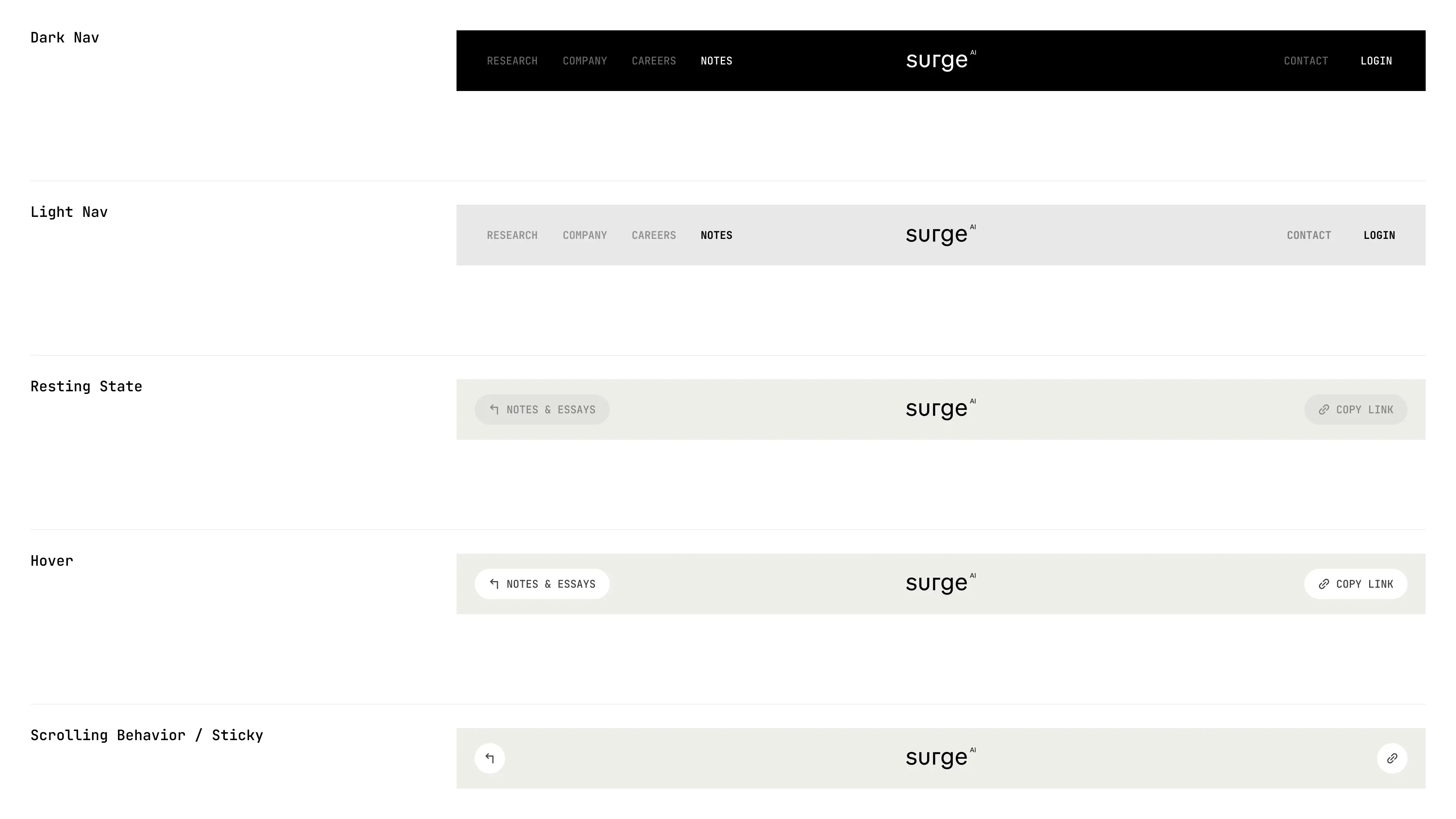
Design systems ensure consistency in visual elements, user interactions, and overall user experience across all products and platforms.
Scalability
Instead of recreating components and styles from scratch, they can use pre-defined elements from the design system. This reduces redundant work, saves time, and improves productivity.
Efficiency
A design system scales easily since it provides a single source of truth for design-related decisions. It allows teams to manage changes and updates efficiently, ensuring a seamless experience as the organization evolves.
Method in the Madness
F500 and Startups partner with us because of our proven processes and scrappiness. We've also been around the block.


Efficient HR Designed on Salesforce

.webp)

Systemizing Growth through Design

Designing the Future of Clinical Trials

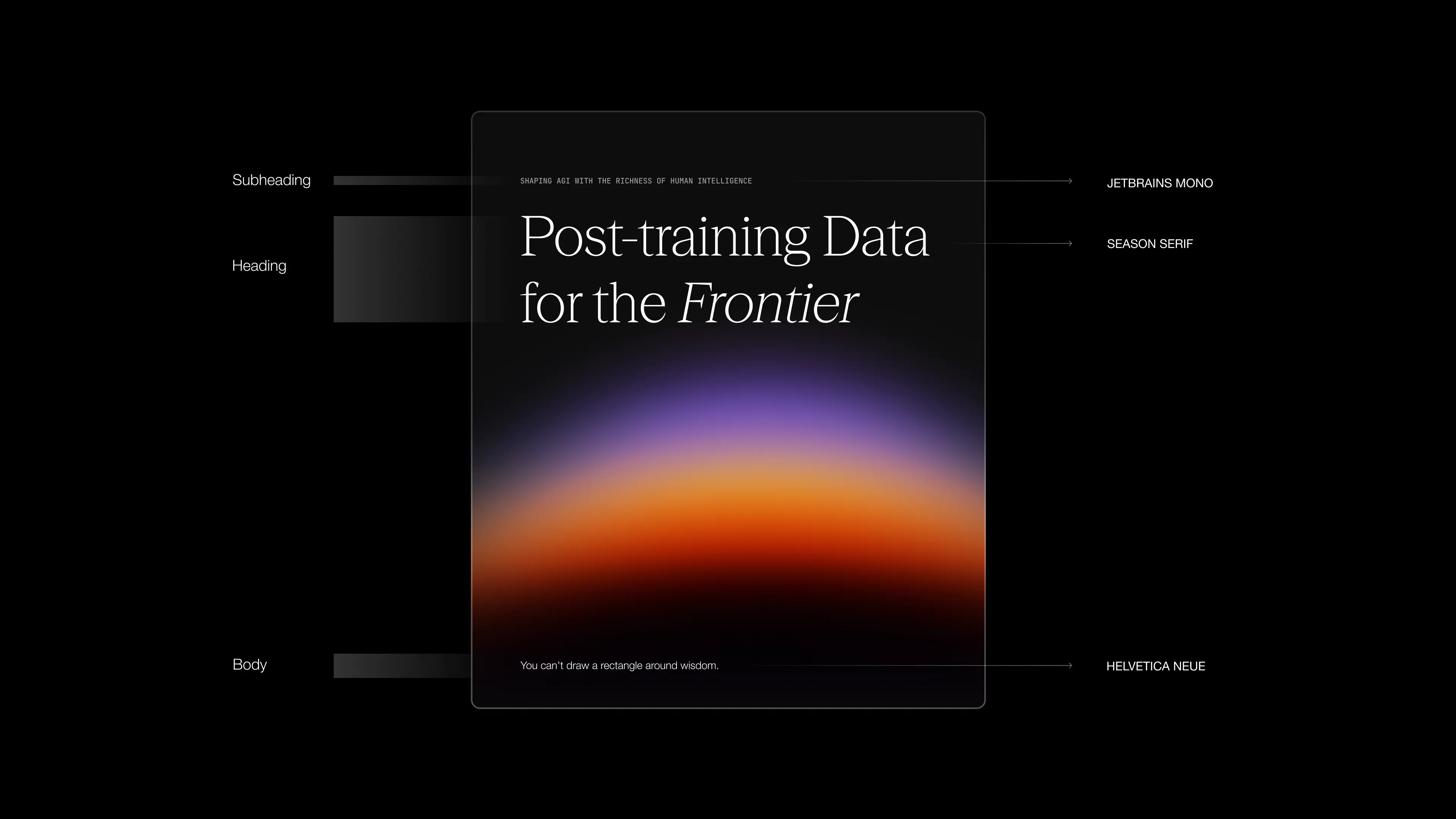
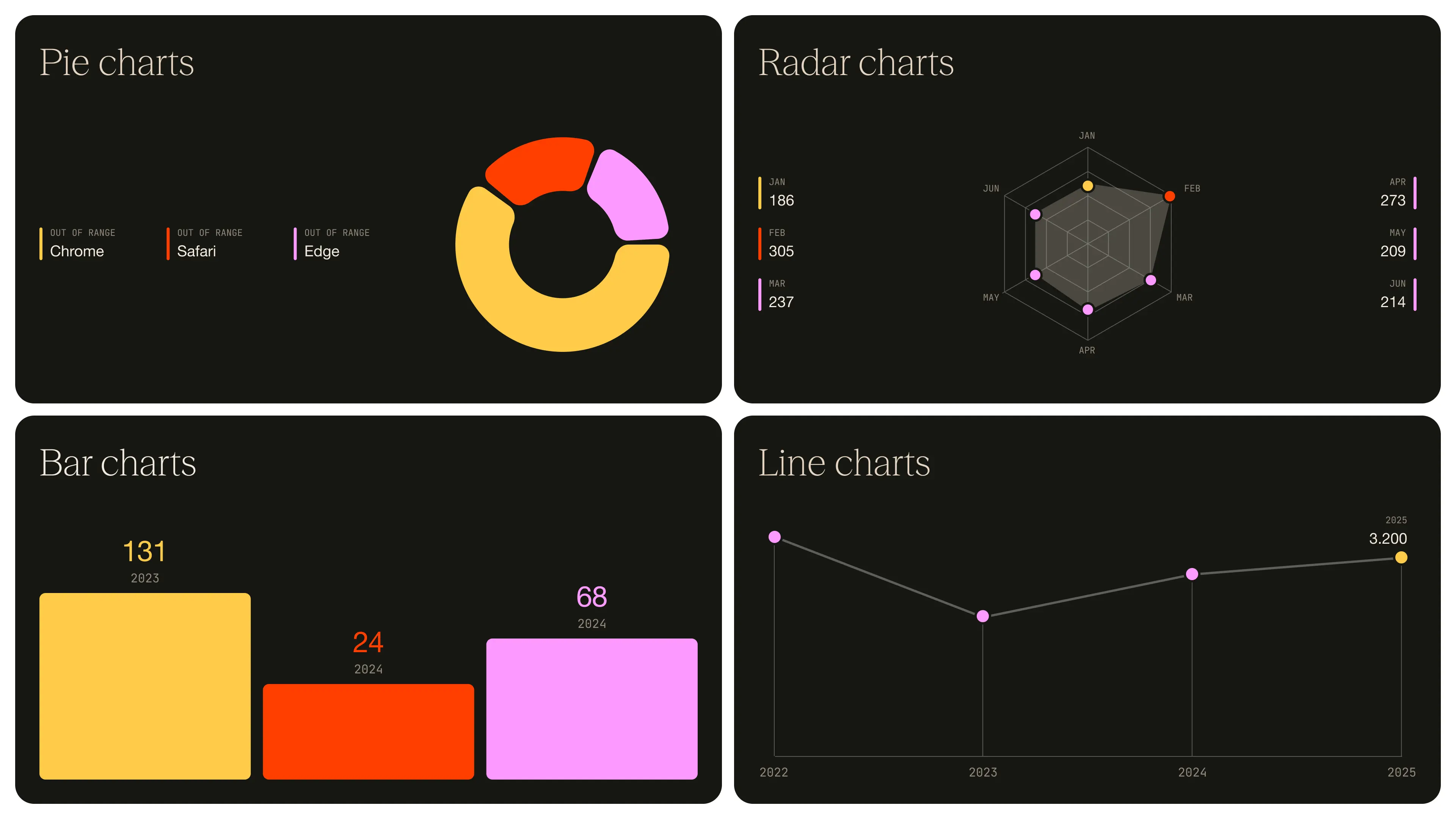
Designing for the World’s Leading LLM’s
.webp)
.webp)


Design for 10 Million Designers


They delivered high-quality and thoughtful work and their designs were outstanding. Beyond the aesthetic, usability and scalability, their designs consider marketing business principles. The project manager was always willing to go the extra mile and clarify questions and concerns in a meeting if needed. They have their processes well established, which makes the workflow very effective.

The design hand-offs went smoothly, which demonstrated the Konpo team's experience and professionalism throughout the project. The team consistently accommodated the company's needs as well as delivering high quality work every time.

We've worked with Konpo for several years and we consider them an essential partner. They've helped us imagine, plan, and design our app from an idea to an experience our guests enjoy and a tool for us as an organization. They are always available, proactive and communicative.

The team is flexible, nimble, and has strong forethought regarding a product's globalization and responsiveness. Their ability to cater to an agile startup mindset also makes them an invaluable design partner.
They delivered high-quality and thoughtful work and their designs were outstanding. Beyond the aesthetic, usability and scalability, their designs consider marketing business principles. The project manager was always willing to go the extra mile and clarify questions and concerns in a meeting if needed. They have their processes well established, which makes the workflow very effective.
The design hand-offs went smoothly, which demonstrated the Konpo team's experience and professionalism throughout the project. The team consistently accommodated the company's needs as well as delivering high quality work every time.
We've worked with Konpo for several years and we consider them an essential partner. They've helped us imagine, plan, and design our app from an idea to an experience our guests enjoy and a tool for us as an organization. They are always available, proactive and communicative.
The team is flexible, nimble, and has strong forethought regarding a product's globalization and responsiveness. Their ability to cater to an agile startup mindset also makes them an invaluable design partner.


Collaboration is at the heart of tackling a design system project. Teams define goals together, shape scope through joint research and analysis, and iteratively develop design principles and guidelines. Designers and developers collaborate seamlessly during development, translating designs into functional components. Comprehensive documentation and training materials are crafted collaboratively to facilitate widespread adoption. Continuous feedback loops and iterative improvements are fostered through ongoing collaboration, ensuring the design system evolves effectively. Through constant communication and shared ownership, collaboration drives the success of the project, fostering unity across the organization.
Deliverables for a design system project can vary depending on the scope, goals, and specific needs of the project. However, here are some common deliverables typically associated with a design system project:
- Design Principles: Clearly defined principles that guide decision-making throughout the design system.
- UI Components: A library of reusable user interface components (e.g., buttons, forms, cards, navigation menus) with associated documentation.
- Typography Guidelines: Detailed specifications for typography, including font choices, sizes, weights, line heights, and usage guidelines.
- Color Palette: A defined color palette with primary, secondary, and accent colors, along with guidance on color usage, accessibility, and combinations.
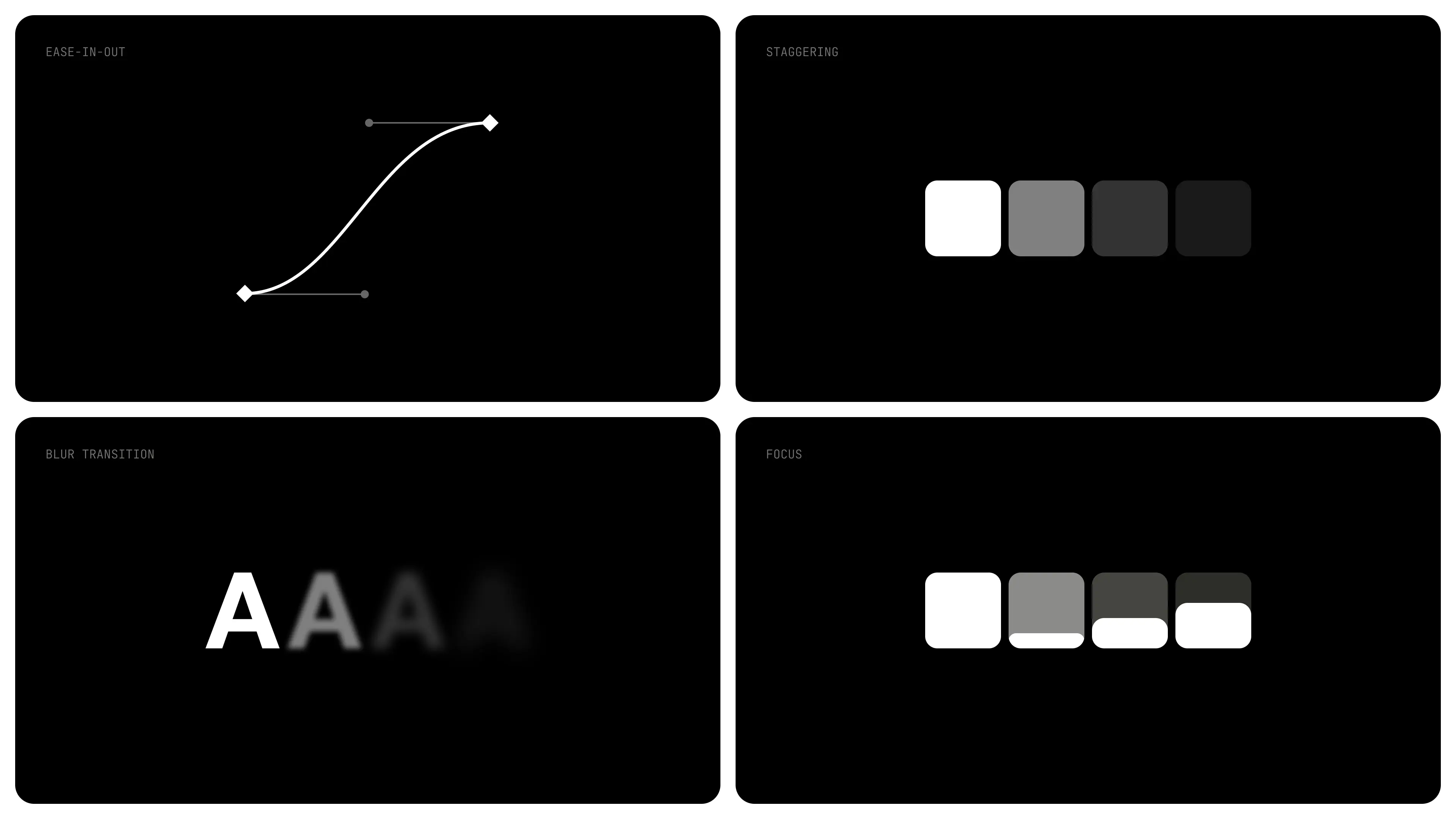
- Iconography: A set of icons consistent with the design system's aesthetic and guidelines, along with guidelines for usage and customization.
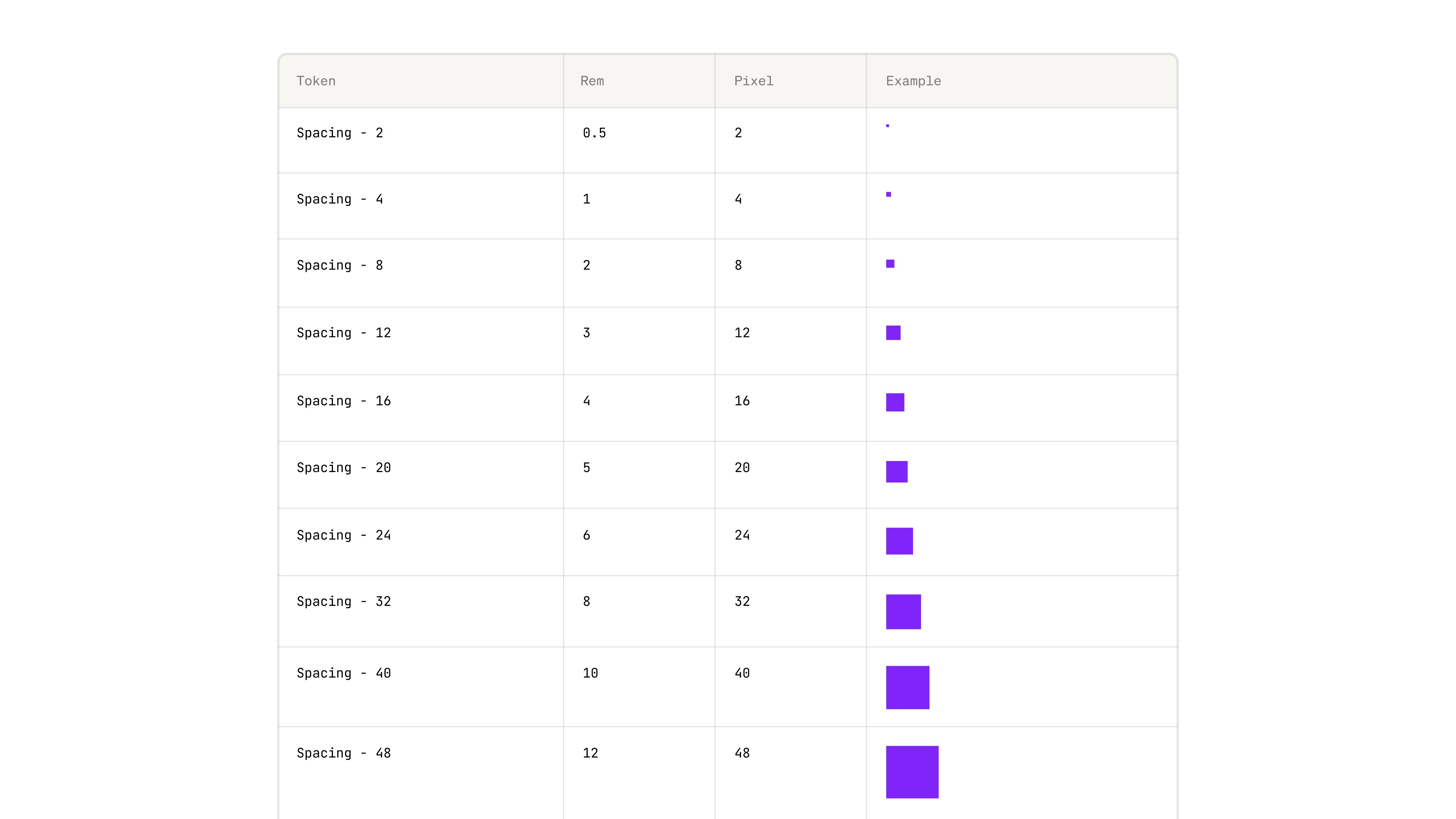
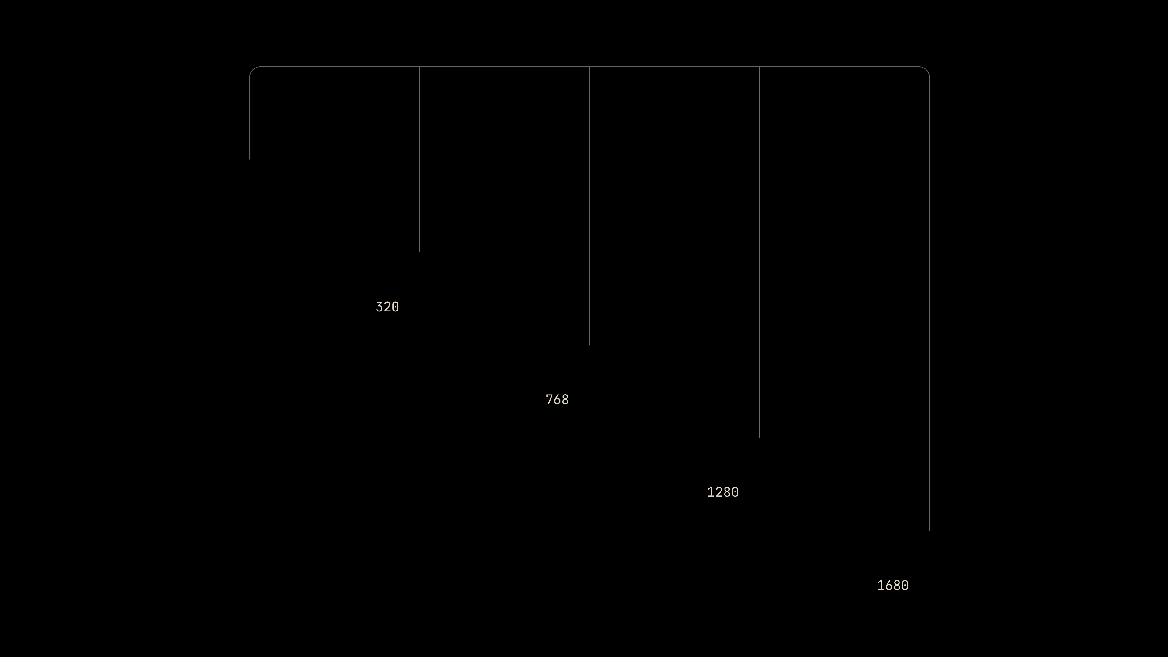
- Spacing and Layout Guidelines: Specifications for spacing, grid systems, and layout principles to ensure consistency and alignment across all components and interfaces.
- Design System Portal: A dedicated website or portal for the design system containing all documentation, guidelines, resources, and download links for assets.
- Training and Education Materials: Training sessions, workshops, or documentation to educate stakeholders, designers, and developers on how to use and contribute to the design system effectively.
These deliverables help ensure consistency, efficiency, and scalability in design and development efforts across various products and platforms.
The timeline of a design system project can vary depending on factors such as the complexity of the system, the size of the team, and the specific requirements of the project. However, here's a general outline of the typical phases and timeline for a design system project:
- Discovery and Planning (1-2 weeks):
- Identify project goals and objectives.
- Conduct research on existing design systems, if any.
- Define scope, target audience, and stakeholders.
- Establish a project timeline and milestones.
- Allocate resources and form the project team.
- Research and Analysis (2-3 weeks):
- Gather requirements from stakeholders, designers, and developers.
- Analyze user needs and pain points.
- Review existing UI patterns and components.
- Conduct competitive analysis and benchmarking.
- Identify design principles and brand guidelines.
- Design Phase (4-8 weeks):
- Develop initial design concepts and visual direction.
- Create wireframes, mockups, and prototypes for key components.
- Iterate based on feedback from stakeholders and usability testing.
- Finalize design decisions for components, typography, color, and layout.
- Develop iconography and illustration style, if needed.
- Development and Implementation (6-12 weeks):
- Translate design mockups into reusable code components.
- Build the design system library/framework.
- Implement responsive design and accessibility features.
- Conduct code reviews and testing to ensure quality and consistency.
- Integrate the design system into existing projects or applications.
- Documentation and Training (2-4 weeks):
- Create comprehensive documentation for components, patterns, and usage guidelines.
- Develop tutorials, guides, and examples for designers and developers.
- Conduct training sessions or workshops to onboard teams to the design system.
- Launch and Adoption (1-2 weeks):
- Announce the launch of the design system internally.
- Gather feedback and address any issues or concerns.
- Encourage adoption by promoting the benefits and features of the design system.
- Provide ongoing support and updates as needed.
- Iterative Improvement (Ongoing):
- Continuously gather feedback from users and stakeholders.
- Monitor usage metrics and performance of the design system.
- Plan and prioritize updates and enhancements based on feedback and emerging needs.
- Regularly release new versions or updates to the design system.
It's important to note that these timelines are approximate and can vary based on the specific requirements and constraints of each project. Additionally, some phases may overlap or require iteration based on feedback and changes in project scope. Regular communication and collaboration among team members are essential for the success of a design system project.
All our design system work is done on Figma.
This depends on the size and breath of the system. Generally speaking this can take up to 6 months and our engagement rates start at 10,000 USD per month.
We’re passionate about what we do, we don’t settle, and we understand what GREAT work looks like to strive towards creating best-in-class design.
If you’re looking for a team that just wants to push pixels, we’re not for you. If you’re looking for a committed team that will push the envelope and aims to deliver value to the organization and the end user, we're a match :)


We're always up for a coffee and a chat,
Send us a message and we'll get back to you!.

.webp)
.webp)

.webp)


.jpg)
.webp)


.webp)
.webp)